Updated Lake House Living in Western Mass
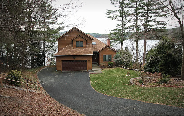
Way back in May of 2021 we had a consultation at a beautiful lake house in Ware, Massachusetts. To be honest I didn’t even know that Beaver Lake existed. One of our favorite western Mass realtors referred this client to us. When we drove into the cute little lakeside neighborhood I couldn’t believe how beautiful it was. We were excited to see the inside of the house.
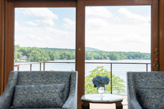
When we walked in the front door the very first thing we noticed was the amazing view of the lake. Because of the elevation of the house when you’re standing in the living room, the kitchen or the family room and looking out the window it’s like you’re on a cruise ship.
All you can see is the beautiful water. These clients purchased this house as their future empty nesting space. They were ready to make it their own. Time to make it a home! You know, one that feels like a warm hug after a long day. We started our consultation like we start all of our consultations, by sitting and chatting and getting to know our new client. We learned that she and her husband would be living in the home full-time and their two grown sons would be there part-time/full-time, you know how kids can be. Actually, if you have little kids then you don’t know how grown kids love to come in and out. But you will soon…. That’s a story for another day.
When we asked her what her style was she said she liked things that are different and updated. But beyond that she wanted us to just have fun and create a beautiful space. Those words are MAGIC to my ears. When a client says that they trust us to create a space that they love, THAT’S when the magic happens! This client was open to whatever we suggested. She didn’t even want to tell us a budget until we came back with the plan. Of course we talked about what kind of quality she wanted and what kind of numbers she was comfortable with. We went through our Budget Worksheet with her to come up with a range. But, she didn’t want us to feel restricted. Can you say dream!
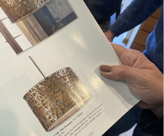
We love showing clients possible products in order to get their reaction and for us to figure out their style. By the end of our consultation we felt like we had a good idea of what her personality is and what her family would like in the space. We took some measurements. We took some photographs.
And we took lots of notes. Already a plan had started to percolate in my head!
It took us about six weeks to come up with plans for some small renovations – new lighting, new carpet, a few rooms of paint, a refreshed bathroom plan and all of the furniture and decor for the house.
We needed to come up with a cohesive plan and color palette for all of the furniture and decor and get pricing for all of it. We also needed to meet our contractors at the house to get quotes for their work. Once we had the plan and all of the pricing it was time to pull it all together.
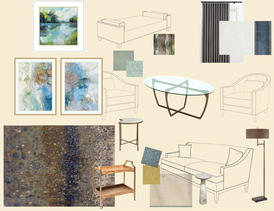
Then we created mood boards and ordered samples of all of the final choices so that our client could see and feel everything at the presentation.
We were excited to present the plans to our client. We gathered all of the colors, samples, mood boards and plans and headed back to the lake house for our presentation meeting. We all sat down on the family room floor, because that was the only choice LOL,
and spread everything out and explained to our client exactly why we chose each piece specifically for their house and how it all worked together. Then SHE was as excited as we were! I think we changed out one or two things in the entire house as a part of the revisions. We swapped those things out, she signed off on the plan, wrote the check and we were ready to get ordering.
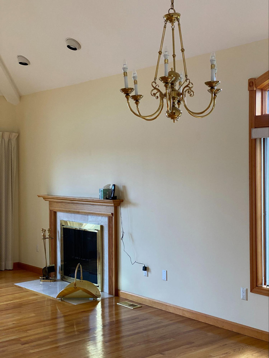
Since there were a few minor Renovations that were going to be done prior to furnishing and decorating we started with those. That way those can get done while we’re waiting for the furniture. The bedrooms, bathrooms and family room got painted. Light fixtures in most of the rooms were replaced. The kitchen cabinet hardware got swapped. And the fireplace doors got swapped.
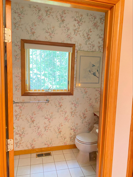
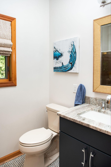
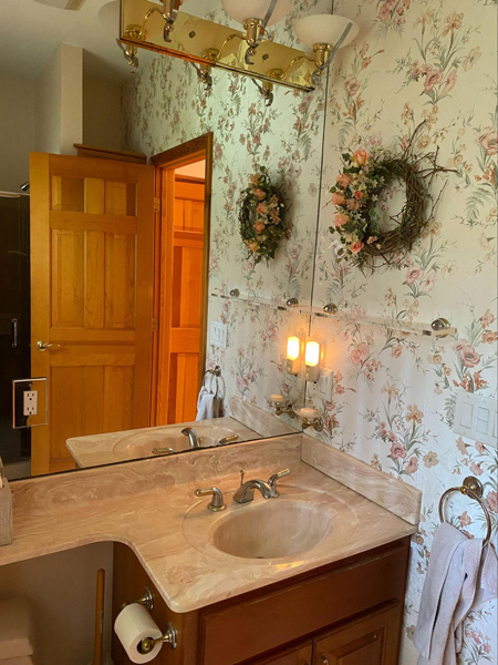
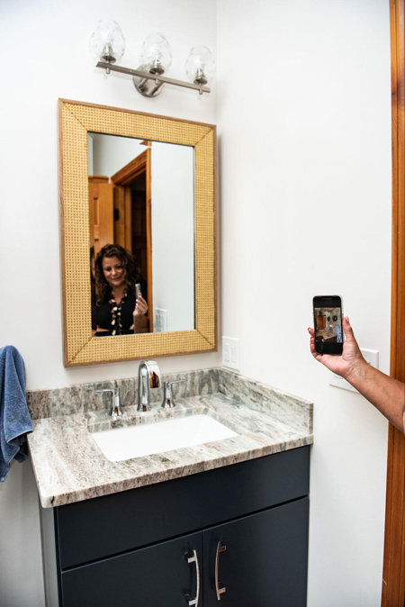
One of the bathrooms got a refresh.
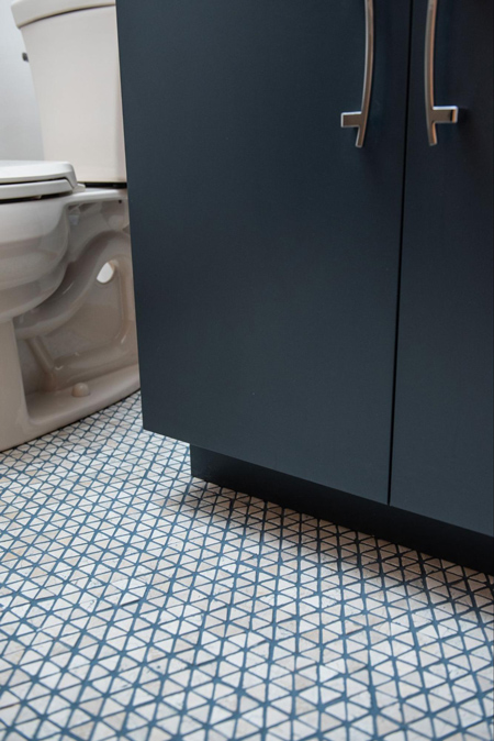
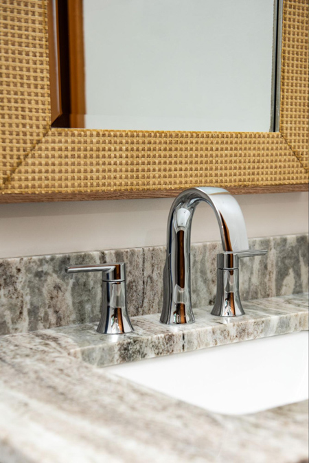
To save on the budget we kept the shower the way that it was, replaced the floor, the toilet and the vanity., added a fresh coat of paint, new window treatments, new mirror and a cute piece of art. Voila! A refreshed bathroom!
We absolutely love how the rough edges on this tumbled mosaic tile creates nooks and crannies for the fun, blue grout! And did you notice how that blue grout goes with the blue vanity?
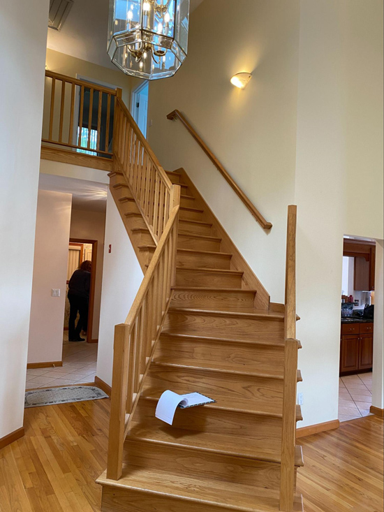
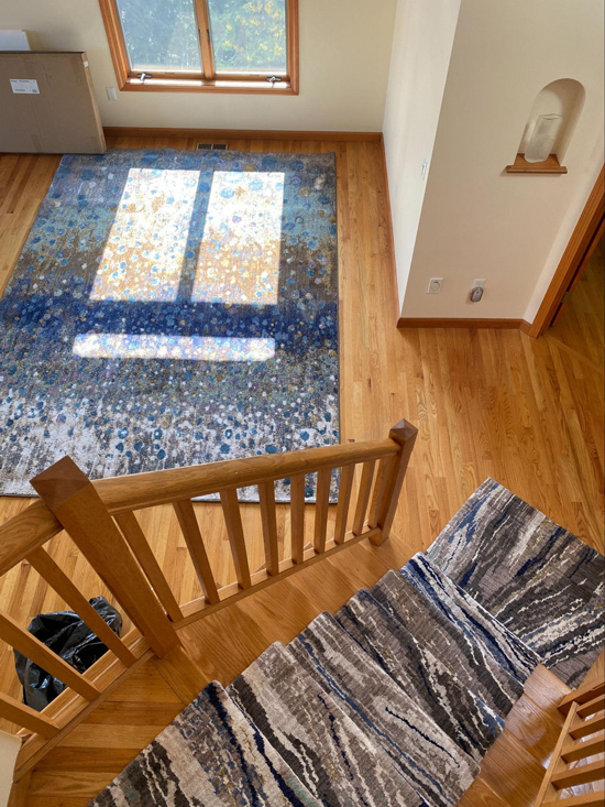
The bedrooms and stairway also needed new carpet.
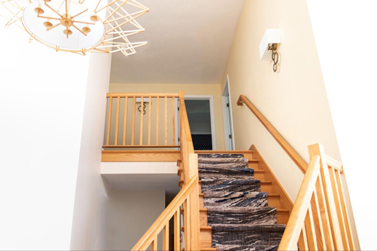
Since this client did NOT want to paint any of their trim we needed to find another way to give the stairway an update.
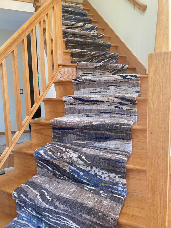
When we were shopping with the homeowner for the carpet we spotted this gorgeous rug.
We loved how the waves in the pattern mimicked the ripples in the water on the lake. And the colors were perfect! The problem was it was an area rug, not a problem. Normally if you are having a stair runner made you choose broadloom carpet and have it cut and bound to the specifications of the stairway. Unfortunately, this rug only came as an area rug. So we purchased multiple of the area rug and had our amazing carpet installers cut it and bind it to the specifications for the stairway.
Then we found two coordinating rugs in the same exact colors to go into the dining / living area that’s open to the stairway.
These rugs set the tone for the color palette for the entire space. They even went well with the pale yellow walls that the homeowner didn’t want to change because she actually loved them.
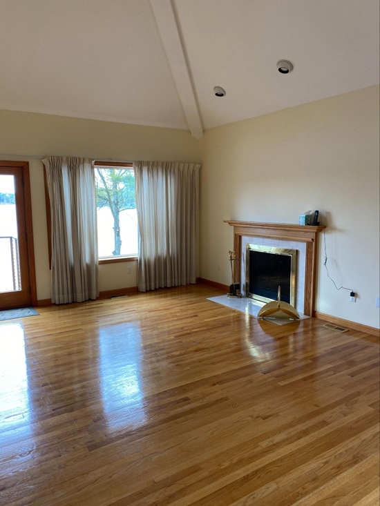
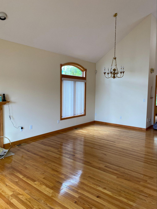
Working our way down, because the homeowner loved the yellow walls we saved some money there by not painting this room with its cathedral ceilings. So as far as renovating in this space all we needed to do was swap the light fixture and swap out the fireplace doors.
Then we got to add the fun stuff, the furniture and decor.
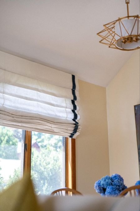
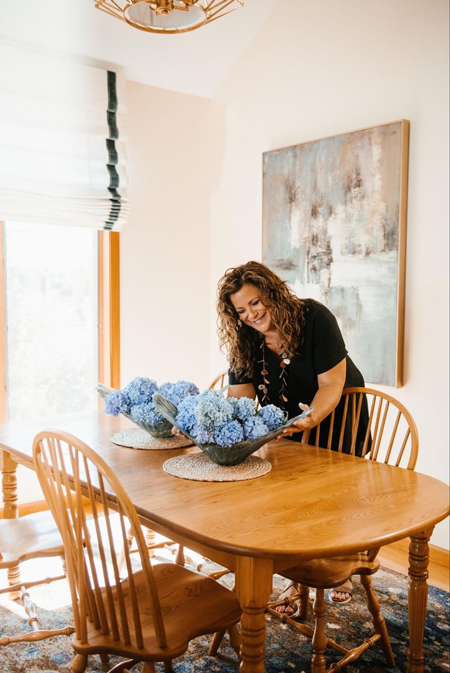
For the dining area, this room is the room where the homeowner’s dining table, that was sentimental to them, was going. We had already chosen the fun area rug and we also chose some modern art. Both give the traditional dining set an update. We also added a large roman shade that matches the draperies in the open living room.
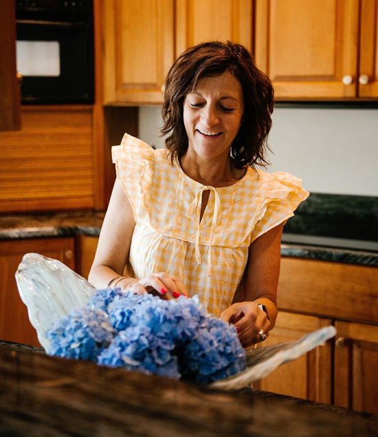
Fresh flowers always freshen up a space. My assistant Lyn happens to be a flower guru. So I leave any fresh arrangements up to her. Thank goodness for her! Because floral arrangements? Not my thing!
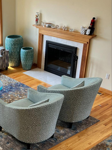
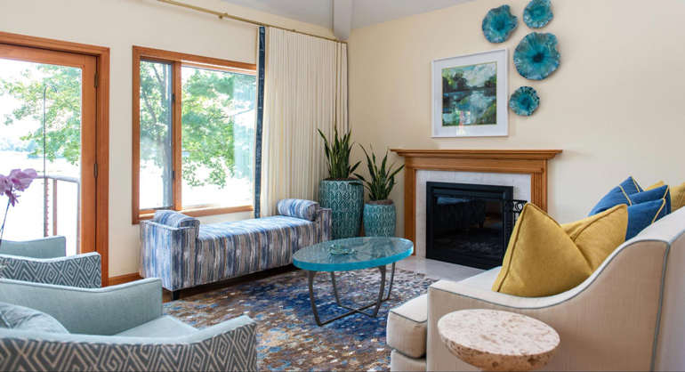
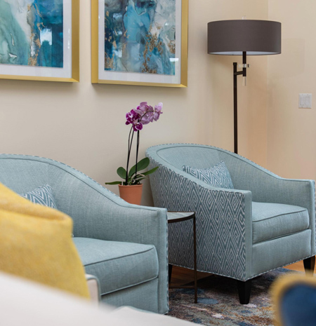
We still needed to choose the furniture and decor for the living area. This homeowner wanted a comfortable place to sit and read in the summer and to sit by the fireplace in the winter. No TV for this area! As the only female in this house, it’s the perfect spot for her to escape from her two boys and husband.
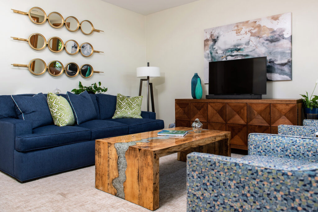
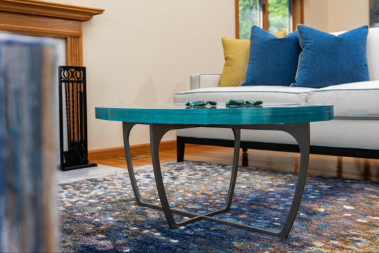
Because this family is all over 6 ft tall we had the chairs and sofas built deeper so that they would be comfortable. That’s one of the perks of ordering quality, custom furniture. It can be whatever size you want, in whatever fabric you want and whatever shape you want. We also chose performance fabrics that are easy to clean for casual lake life living. We also added a wall of custom draperies for those super sunny mornings or those icy cold winter days. The homeowners don’t use the door so the draperies can pull from wall to wall when needed. But the pièce de ré·sistance in this living room is the custom coffee table with its 3” thick piece of seascape fusion glass that, once again, mimics the water on the lake! And I also love the wall sculptures that we used to frame the colorful art. What a great space for her to hang out in!
To see all of the photos of this updated lake house click HERE
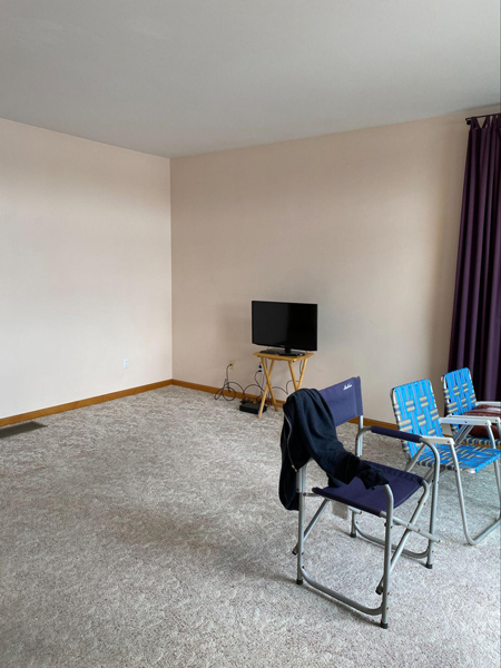
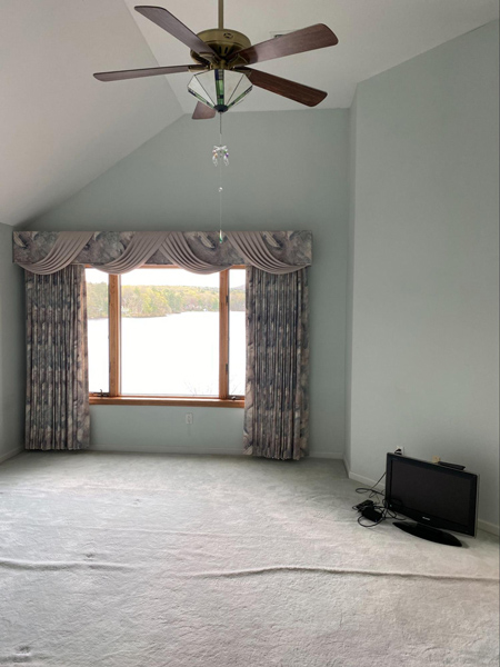
I bet you’re wondering what the other rooms look like! Here are a couple of BEFORE pics to give you a sneak peek. But you’ll have to come back for the next blog to see how they turned out……
It’s almost like a season finale when you have to wait until the next episode comes out. I won’t make you wait months though!
In the meantime, please let me know what you think so far!
Comment here. Share the pics on your social media. Tag us!
We LOVE when you PIN our blog, that’s why we give you this cute little Pinterest pic!


What a great project, Wendy! How wonderful for your clients to have such a fresh, updated, beautiful home…and that view!!
This is a lovely home now. I appreciate the blues and how you thoughtfully included the lakeside location in your design solutions.
I love how you turned a potential obstacle [ the rug situation on the stairway ] into a solution that works so beautifully for your client, Wendy. This is why it pays to hire a talented interior designer > solutions others can’t see are possible!
And that cocktail table with it’s custom glass? Lovely!!
What a remarkable transition and I love all of your choices! What a treat to have a home like this to come home to! Well done Wendy!
What a beautiful blue color palette for this lake house! Seems like the yellow walls was a good compliment too!!