
How to Use Antiques in Modern Décor
Using Old Furniture in a New Room – Part 3
The room was really coming together.
We had decided what pieces would stay and what pieces would go.
You can read about that here at Part 1.
We had chosen all of the furniture and a new rug.
You can read about that here at Part 2.
Now it was on to the fun stuff!
When choosing art and accessories you need to start with color and metal finish.
This room’s antique pieces had gold hardware and the coffee table was a bronze.
So I knew that we would use gold as our metal finish.
The walls were blue. The sofa was gray. And we had a ton of browns with the wood finishes.
It was time to add some lightness with gold, glass and some pops of sea foam and pale green.
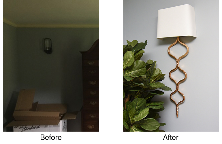
One of the very first things I knew I had to do in this room was replace the sconces. Moving the electrical boxes was not an option. With the height of them I knew I needed to choose some long sconces that would take up the space below and be in better scale.
I chose the gorgeous, gold finish sconces for their length, but also just because I fell in love with them!
Their shape actually helped us choose the chairs because of their pattern!
Once the rug and furniture (and sconces) are chosen you need to choose the window treatments. You should always choose the window treatments before the art and accessories. The window treatments, when hung properly (high & wide, you can refer to https://www.detailsfullserviceinteriors.com/how-to-hang-curtains) take up a portion of the wall. Therefore, you won’t know what size art to get until you know how much of the wall you have to work with, right?
This room didn’t need window treatments that provided privacy or light management. That’s easy. We chose simple off-white panels that blended with the crown molding. The fabric also had gray dots to match the sofa, in a pattern that mimicked the chair pattern, which mimicked the sconce pattern. See what we did there? Interior designers do this all the time! We repeat patterns throughout the room to create a cohesive space.
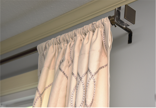
For rods we chose brushed gold to go with the furniture hardware.
We chose glass finials to go with the coffee table and to add a bit of bling. And, of course, we hung them high and wide to let in the most amount of light possible.
Next it was time to choose the artwork.
I knew we needed a large piece over the drop leaf table to balance out the height and weight of the armoire on the opposite wall.
We chose a large round mirror in gold and bronze, perfect!
We also needed a large piece for over the sofa to balance the height of the windows on the opposite wall.
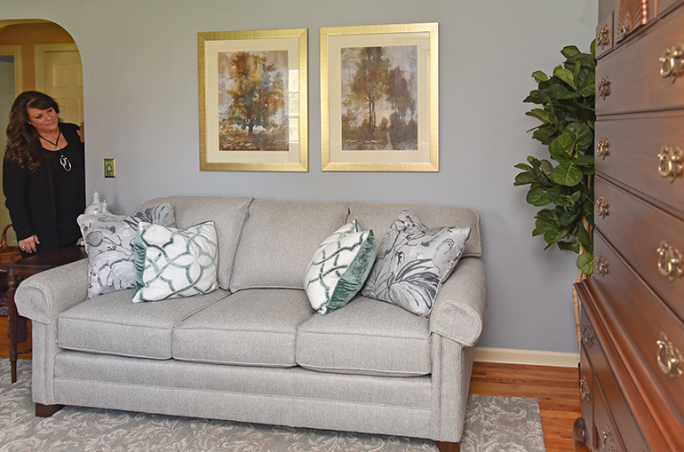
We chose two art pieces with trees, since this is a New England home. We got them framed in a brushed gold frame to blend with the rest of the gold in the room.
The last art pieces were the small prints for between the windows.
We chose gold leafed leaves. They went with the tree art and were the right size for between the drapery panels.
Next it was on to the rest of the lighting.
With no overhead lighting in the room, we needed some table lamps.
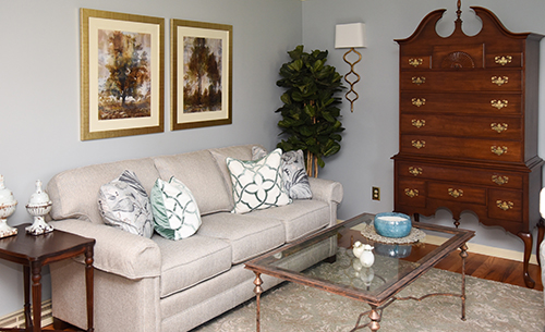
I first chose the antiqued one for between the chairs. It had the pop of green in the chairs and it also, again, had the shape of the sconces, chair fabric and drapery fabric. It also had that antiqued look that made the room a little more relaxed. And, it wasn’t so tall that it would block the art above it.
The lamp on the drop leaf table was chosen for the opposite effect. It had a modern sleek feel that toned down all of the antiques in the room.
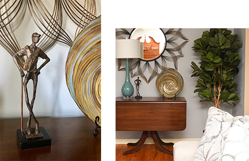
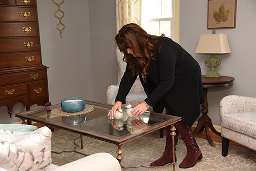
Lastly, it was time to fill in with a few accessories.
This room didn’t need much. It had gorgeous furniture, art, and lighting. But, I always add accessories that make a room personal.
I hunted high and low for a golf accessory. This family has a passion for golf.
I could check off the personal item.
I added a couple of throw pillows to the sofa for some more color.
I also wanted to add a few more glass items to lighten up all of the dark wood.
The candle and birds on the coffee table do just that, along with a beautiful glass bowl on the side table.
Lastly, every room needs a plant or two for some texture and some life. This family opted for faux. And with the lack of natural light in the room it was the best option.
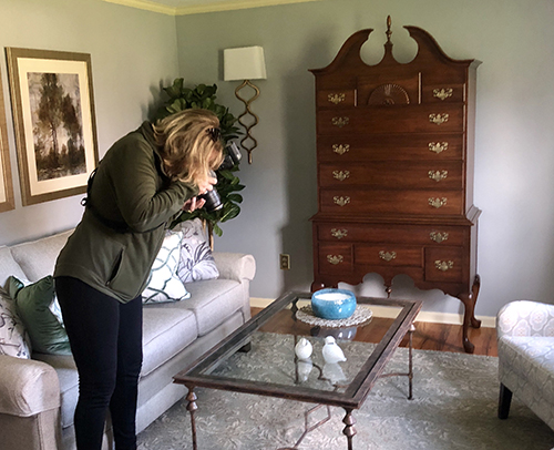
And, just like that, the mix of antiques and modern pieces comes together perfectly, and the room was ready for it’s close up. (Thanks to Maryellyn Roche, of On 3 Photography. She’s the best!)
The modern pieces update the antiques.
The antique pieces add history and character to the room.
The colors are fresh and new against the warm wood tones.
And a family has a space that they can enjoy for years to come!
Let me know your favorite part of this space in the Comments below.
You can check out how Details can create your comfortable, personalized space on the Services page.

