
I go into a lot of homes, obviously. But, there are certain decorating mistakes that I see over and over.
So, let’s get them corrected. Ok?
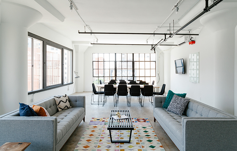
Area Rugs That Are Way Too Small
I like to call these Postage Stamp Area Rugs.
Your living space area rug should ideally be 12 – 18” in from the perimeter of the room. If you think that’s too big then it should AT LEAST be under the front legs of the furniture in the seating arrangement.
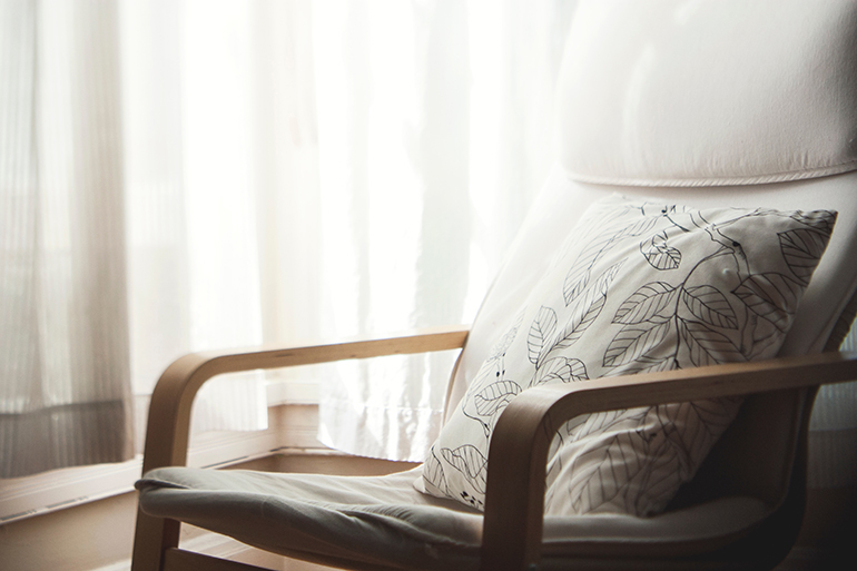
Flood Ready Draperies
If you’re hanging a drapery, PLEASE hang it to the floor, NOT to the bottom of the window, NOT to the top of the heater. If you simply cannot hang a drapery in front of your baseboard heat, then don’t hang a drapery on that window. Go with a different window treatment, like a roman shade.
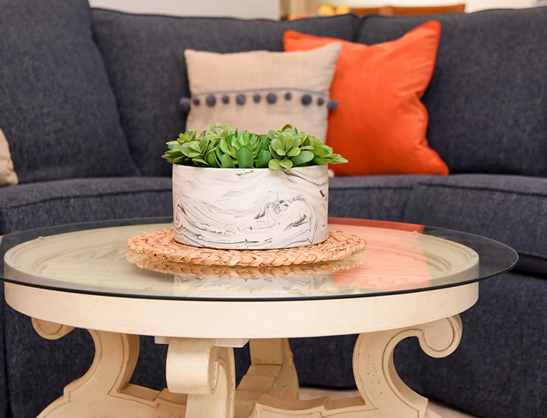
Non-Existent Coffee Table
I find it so funny that I have this discussion with clients all the time. It actually never occurred to me to not have a coffee table in the middle of a seating arrangement. A coffee table acts as an anchor to the seating arrangement. It pulls it all together. It doesn’t have to be a pointy corner table that your little one could bump into. It could be a round ottoman. It could even be a few small tables bunched together, so you can easily walk through them. But, you do need something acting as a coffee table in the center of your seating area.
Pillowless Sofas
A sofa without throw pillows is like a cake without frosting! Who wants that?
It’s such a missed opportunity AND it’s no fun! I’m not talking about the pillows that come with the sofa either. I’m talking about some additional throw pillows. You can get some that pull in the accent color in your room. You can get some fun, sparkly ones. You can get some warm, flannel ones. Get whatever you like. But, please add a little touch of whimsy to your sofa with some throw pillows.
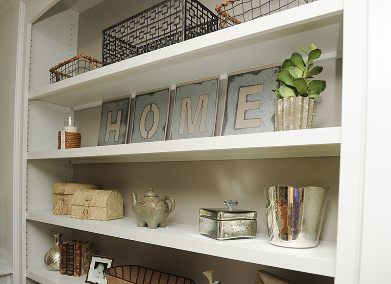
Accessories without Meaning
This one is huge for me! If you’ve been following this blog or any of our social media, you know I use the hashtag #DecorateWithWhatMakesYouHappy. I feel really strongly about this. The accessories in your home should show who you are. People should be able to walk into your home and find out something about you by simply looking at your accessories. What are your accessories in your home saying about you?
Tiny Little Art
Most likely you have a bunch of wall area in your home. That’s a blank canvas in itself. So use that area for some great artwork. My rule is that you want to see the art, not the wall around it. Use up that wall! You should see more art than wall in the space over your sofa or above your bed. Go big!
Art Way Up There
You don’t want to be craning your neck looking up at artwork.
Art should be hung at eye level. You know, so you can look at it! A good rule of thumb is that the center of the artwork should be 60” above the floor.
Look around your home.
Are you making any of these decorating mistakes?
Can you fix them immediately, please? ☺
Or, head over to the Services page to see how we can help you remedy the error of your ways. ☺
www.detailsfullserviceinteriors.com/services
Decorating for Fall

OMG, all of these decorating mistakes made me cringe. I hate when I go into someone’s home and they have the wall art hung way up on the ceiling. I also hate the high water curtains. Great tips!
Thanks Tia! The burden of a designer’s eye, right? 🙂
Thanks for sharing I don’t want to make these mistakes!
Some of these make me cringe too! Great tips to have!!
Great points, Wendy. I agree with all of them. The one that makes my skin crawl is art hung too high. Such an easy fix that makes a world of difference.
OMG the one with the artwork too high is my biggest criticism! I just want to snatch it down. These are all good tips provided in the post.
These are excellent tips!! Thanks for sharing
I’ve seen most of these mistakes made time & again. Great post Wendy
I love it! Accessories with meaning. My house is still kinda empty because I am waiting on pieces that speak to me.
You would think these errors would be obvious, but they are not. Thank you for sharing your insights into what to avoid as you decorate.
Elaine