
Top Tips for Picking the Perfect Paint Color
How to Choose the Right Paint Color the First Time!

Picking paint colors can actually be super complicated.
Have you ever gone to the paint store and looked at that wall of paint options?
It’s totally overwhelming!
Then you get home; put up the swatch and that perfect gray you chose turns out to be baby blue in your room!
Now, being a trained interior designer, I can get all “look at the undertone” and “make sure you check the hue”, but when it comes right down to it you guys don’t want to hear all the designer gobbly goop.
So, here are my top tips for choosing the perfect paint color for your home, in layman’s terms.
Don’t choose the paint color first.
If you have an inspiration piece it helps.
Do you have a throw pillow or a painting that you love the colors in?
Hold the paint swatches up against the piece to choose.
Or, you can even take it to the paint store and have them color match a color from it.
Simple!

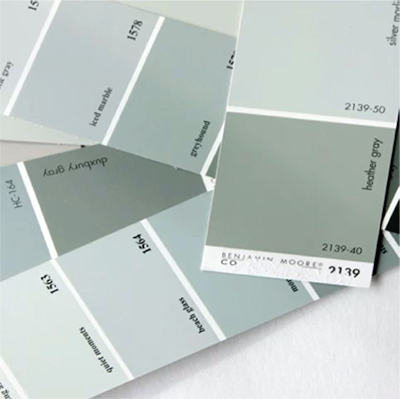
Check the full paint swatch that the color is from.
The top color on the swatch is the lightest. If you scroll down to the bottom color on the swatch you’ll see the darker version of that color. So, if you choose what you think is going to be the perfect gray, you can look it up on the full swatch and glance down to see it’s darker version. If the darker color is a navy, then chances are when you paint that gray on your walls it could have a blue hint to it in certain lights.
The same goes for every color.
If you pick a cream color and are afraid that it’s going to look yellow in your home, scroll down to the bottom of the swatch and see what the darkest version of it is.
Easy!
EXAMPLE –
See this perfectly pleasant gray called Starry Night by Sherwin Williams?
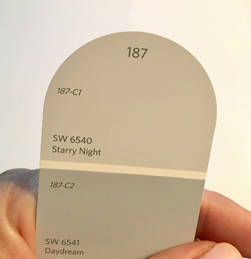
It looks like a nice neutral gray, right?
But, scroll down the card…
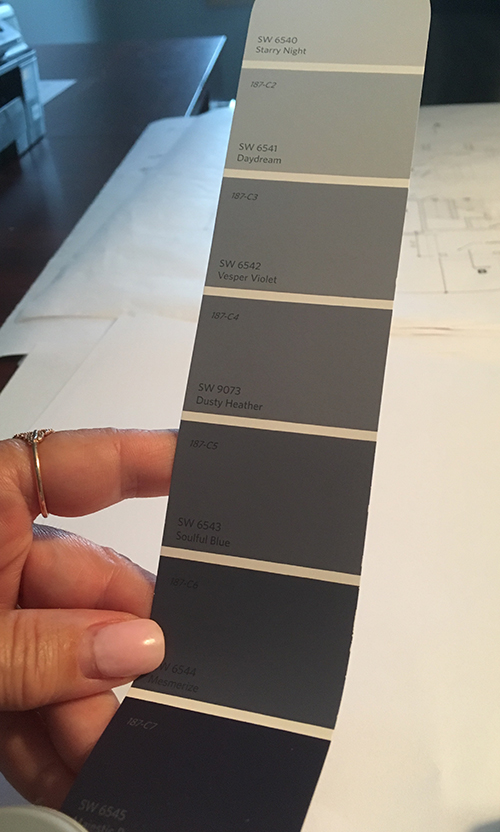
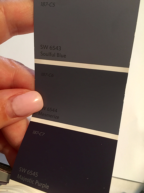
…and you’ll see that in certain spaces it could look lavender becauuuuuse all the way down at the bottom is…
…Majestic Purple!
Consider the lighting in a space.
If your room gets full, direct sun than any paint color in that room is going to look warmer, more yellow. If you have fluorescent or halogen lighting in a room, colors are going to look cooler, less yellow.
That’s why you can’t go to a friend’s house and fall in love with their paint color and think it’ll look the same in your house.
You NEED TO TEST the swatch; in the room it’s going to be in, when it’s sunny, when it’s cloudy, during the day and at night. That way you’ll see what it looks like IN that room, under every lighting situation.
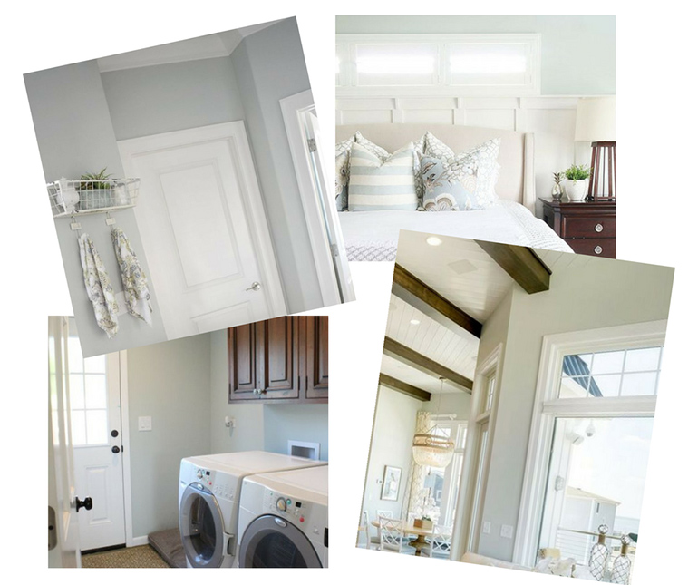
In the picture below ALL of the rooms are Sea Salt by Sherwin Williams.
See the difference?!
Consider the flow from one room to the next
You have to look at the paint colors for your entire home and how they look together.
Chances are you can see from one room to the next. You want colors that look good together when going from room to room.
One way to achieve this is to choose different shades of one color from one paint swatch. You could do your kitchen in the lightest, your adjacent dining room one color down, your adjacent family room in the third color down and so on. It’s the easiest way to give your home a cohesive look and know that the colors in your home will blend well together.
If you still need help with paint colors you can get 2 eGuides that include
46 paint colors, including whites, bolds, grays, trim colors and more!
Plus, they include MORE painting tips and a sheen chart so you KNOW whether to use semi-gloss, satin, etc. for your paint project!
Simply go to https://details.mydomastudio.com/store/guides/25FoolproofPaintColors-15MoreFoolproofPaintColors-SoYouCanAvoidTheDo-Over
to get yours BEFORE August 31, 2017!
OR, you can get the 25 Foolproof Paint Colors – So You Can Avoid the Do-Over for FREE by going to www.detailsfullserviceinteriors.com and entering in your email address.
If you would like to schedule a Paint Consult, head over to www.detailsfullserviceinteriors.com/services and Book a Consult https://details.mydomastudio.com/store/Consultations/DesignConsultation
Or, contact me right on the bottom of the page.


It sure was nice to know that I can actually choose a paint color that perfectly matches the decor that I love the most. There is actually a painting that I intend to use as the centerpiece of the living room for my redecoration project. I will ask the painting contractor to take a look at that one and choose a color that will complement it to make it stand out.
Nice information about the color combinations. It is really helpful.
I thought it was great how you said to consider the lighting in a space when choosing a paint color. My wife has been wanting to repaint our house for the last few months. It may be beneficial for us to hire the services of a professional painting company.
To pick a perfect color for your home you will need to start choosing your surroundings means you will need to select color according to your furniture and all your belongings to give an attractive interior of the room.
I appreciate the tips about lighting in this article. It never occurred to me that paint appears different colors depending on what type of light is shining on them. I’ll have to test out my options when selecting paint in the future.
I never thought to choose the paint color around a piece that I really like. I have this throw pillow that I absolutely love, I will have to find some paint swatches that go with it. Maybe this way I will finally be able to choose a paint color that I am in love with.
Thanks for the tip to look at swatches in multiple weather conditions to make sure we understand how the warmth or coolness of the color will be brought out. My husband and I want to redecorate our master bedroom within the next few months to help it appear more modern and stylish. We plan on hiring a painter to change the color of the walls, so your tips will be really helpful as we start trying to choose a color!
It’s such a good tip to get the full swatch to see the darker version of that color so you’ll know what it’ll look like in different lights. The blue I want actually has a hint of purple once it gets darker. Luckily I’m fine with having a purplish tint because it’ll still match my room pretty well.