
How to Use Antiques in Modern Decor
Using Old Furniture in a New Room – Part 2
Not every project is a complete redo.
Most of my clients have at least one piece of furniture that they want to incorporate into their new, updated space.
You can use antiques, or other well-loved pieces of furniture in an updated, modern room. But, how do you do that and not have the piece look totally out of place?
We did it perfectly with this living room if I don’t say so myself.
Here’s how we made the homeowners traditional pieces fit perfectly into their new, updated living room.
Last week we went over where we started.
Part 1 – How to Use Antiques in Modern Decor
For a quick recap
In this, Part 2, I’m sharing how we chose the area rug and furniture pieces that would not only go with the antiques but also serve to update them.
Whenever I start a project I ask what stays and what goes.
These homeowners were off to a great start with a coat of blue paint and some beautiful case goods that they wanted to keep – a Queen Anne armoire, a drop leaf table, a grandfather clock and some side tables.
It was great to have a beautiful color and some fabulous pieces to work with.
But, it would have been easy to just go traditional and decorate the room with all traditional pieces, with traditional lines and colors. Bo-ring! Right?
So, we needed to add modern pieces in up to date colors.
But, if we went too modern in too trendy colors it wouldn’t stand the test of time AND the new pieces wouldn’t blend with the antique pieces.
See why they called in a professional???
To me, this is the FUN of my job!
Where to start?
We knew the color.
We had some furniture to work with.
And, we knew what had to go
Refer to Part 1 – How to Use Antiques in Modern Decor
The next step was to decide what we needed to add.
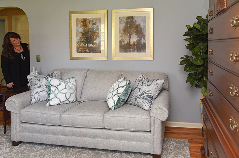
First, we needed a new area rug.
The current one was much too dark and felt a little dated.
I chose a much lighter one. It had the gray I wanted to add to the room and it felt modern, but the pattern was actually a classic. See how that walks the fine line between being updated and being modern?
To be honest, this one was a hard sell to these clients. They were used to a much more traditional rug style. In the end, they said my favorite 3 words “We’ll trust you.” And it worked out. They love it.
The next step was the sofa.
Once again we needed a fresh feeling fabric that also blended with the antique pieces.
We went with gray for an updated and light color, but in a classic tweed pattern. We also chose a rolled arm for a classic look. This one is custom by King Hickory, but you can find a similar one here – Vencetio Sofa
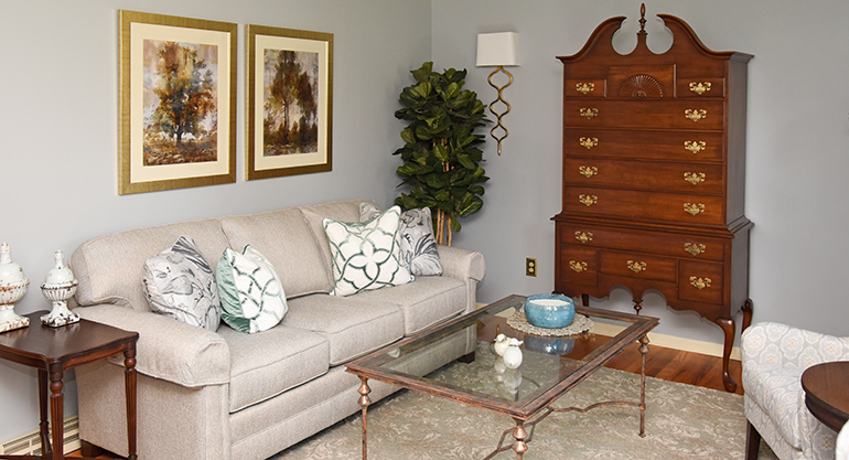
Once we had the sofa and the area rug chosen it was apparent where the KEEP pieces would go.
We would place the sofa on the long wall.
We’d keep the armoire where it was centered between the sconces (more on them in the next blog post, when we go over how and why we chose the lighting, accessories, and draperies that we did.)
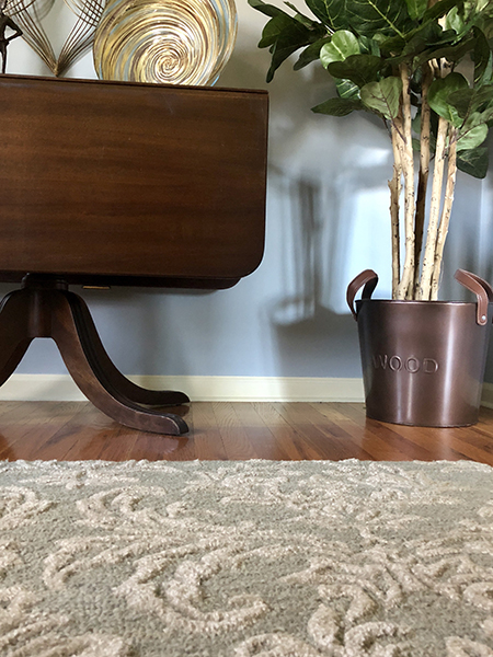
We’d add the drop leaf table to the opposite wall, in order to balance out the wood tone, one wood piece on each wall.
We’d add an end table on one end of the sofa.
But we needed a conversation area. When you’re arranging your furniture you want it to be in a conversation area. You want people to be able to sit on one piece and be able to comfortably talk to a person on another piece.
So, we needed a couple of chairs.
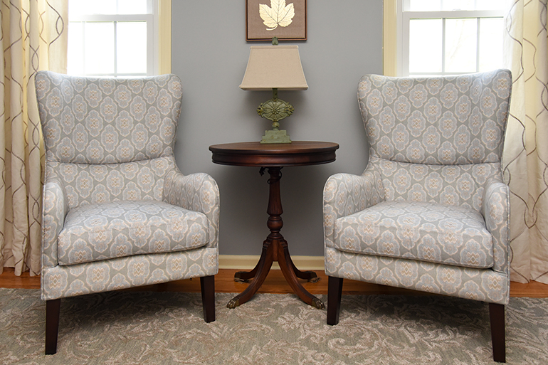
These modern wingback chairs were another “hard sell” to these clients.
They were used to a classic wingback chair in a traditional fabric.
Even though they’re wingback chairs, they’re quite modern, in their lines and in their fabric.
I chose them because the fabric is bright and adds some fun to the space.
We placed them across from the sofa and added one of the antique end tables between them.
I think they really make the room!
These are to the trade only but you can find similar here – Aubrey Accent Chair
The last piece of furniture we needed to add was a coffee table. You need a coffee table to balance out the seating area. It also provides a place to put your drink down, and an accessorizing opportunity. ☺
For this room we already had enough wood, that’s for sure.
So we didn’t want a wood coffee table.
We needed something lighter BUT it couldn’t be so light that it felt overpowered by the armoire.
The room also needed a little bling, something shiny to offset all that wood.
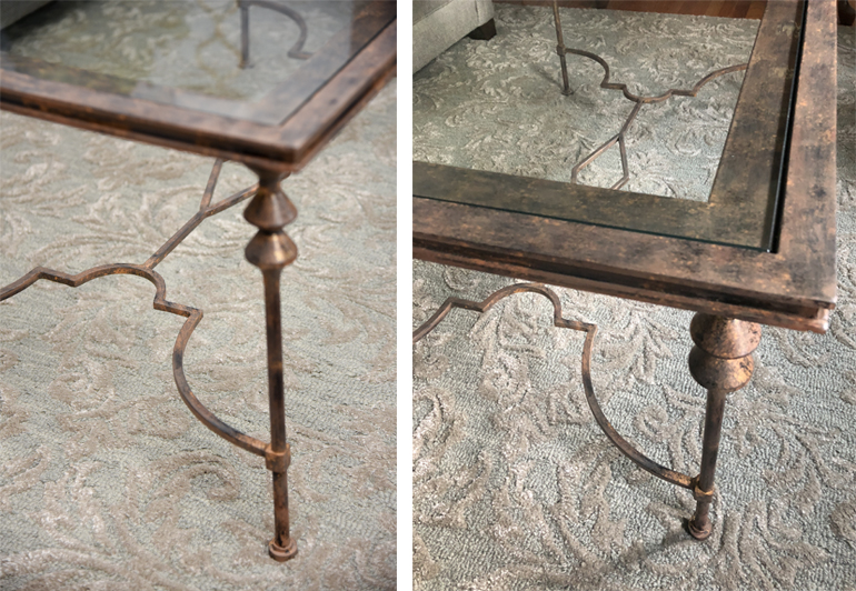
That’s how I knew we needed a glass and metal coffee table.
We could have gone with gold to go with the hardware on the armoire, but that was a little too blingy for these clients.
So bronze it was. The bronze tone blended really well with the wood.
Next was the line of the coffee table. It needed to have an updated line so that it felt modern, but it also had to go with the traditional lines of the wood pieces.
This table from Uttermost was perfect. The weight of it held up to the armoire, but the lightness of the glass kept it bright. The lines were both modern and classic at the same time.
You can purchase the exact table here – Quillon Coffee Table
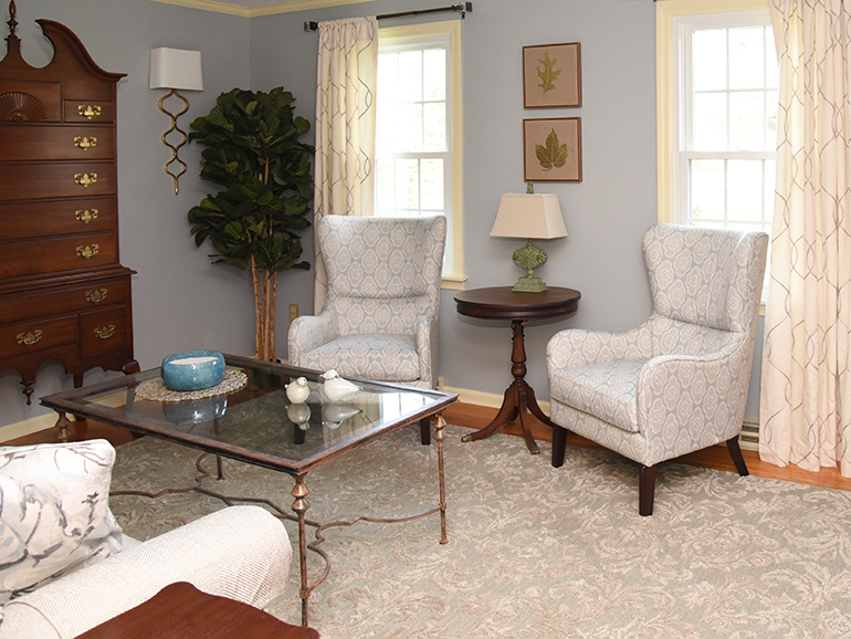
The room was coming together.
We had all of the furniture pieces chosen.
On the next blog, we’ll go over how we chose the lighting, art, accessories, and draperies to finish off the room (my favorite part).
Make sure you’re signed up to receive our emails so you DON’T miss a thing!
Just enter your email right up at the top of this page.
If you really can’t wait to see all the pictures, this project was featured in our Year in Review video. You can check that out below.
And feel free to Share this post on your social media.
How to Use Antiques in Modern Decor

I really love antique furniture and the sense of refinement and history they carry, and your tips for how to incorporate that style into my more modern furniture is really helpful. Getting fabric in the upholstery and carpeting that is fresh but with classic patterns, as you describe, is definitely a great way to play off of the style of the older furniture. Using modern versions of classic styles, like the wingback chairs you talked about, is perfectly genius, and I’ll definitely take your tips to heart when picking out furniture for my new living room.